
Yuma's site is calm and plainly built. A white field runs the whole way down, colour arrives in full-width bands rather than in flecks, and one purple shows up only where you are meant to act. Headlines are sentence case with a full stop kept, one thought per line, and nothing is set in caps or italics anywhere. The pictures carry the argument, real console screens and product comps, while the copy stays short and literal. "Resolve, don't just respond."
The site already tells one story well, that the agent takes the action instead of drafting a reply someone still has to send, and a feed is where that story can be shown a ticket at a time. There is a lot of material on yuma.ai that a post could reuse straight away: the resolved-count tile, the auto-pilot toggles, the merchant quotes sitting on the mint band. A weekly rhythm of small, concrete posts built from that same material would let the evidence work more than once, and it would look like the site rather than like a template.
- Headlines: Figtree 500 to 600, sentence case, tracking pulled in about -0.02em at 48px.
- Body and UI strings: Inter 400 around 14px, 500 when a label needs to rank.
- Hierarchy comes from the size gap between a 48px headline and 14px body, not from heavier weight.
- The site sets no italics anywhere, so every line stays upright.
- One display family and one body family, sentence case throughout, no all-caps labels.
0123456789
white
field
purple
big
radii
product
shots
- Real product screens. The Ask Yuma chat, the auto-pilot toggles and the resolved-count tile all still read at thumbnail size.
- Photographic objects on a plain grey studio backdrop, placed behind or beside the UI cards, the way the hero comps already do it.
- Real people in the cards and real merchant logos on the mint band, matching the customer strip on the home page.
- Thin white connector curves linking floating cards, used sparingly, one or two per comp.
- Redrawn or mocked-up product UI. A real screenshot is stronger every time, and it is the one thing a reader can check.
- 3D renders, gradient meshes and abstract icon collages. The flat cards already carry the idea and the extra texture would fight them.
- Hard drop shadows. Your depth comes from a white card on colour, so anything heavily dropped reads as a different brand.
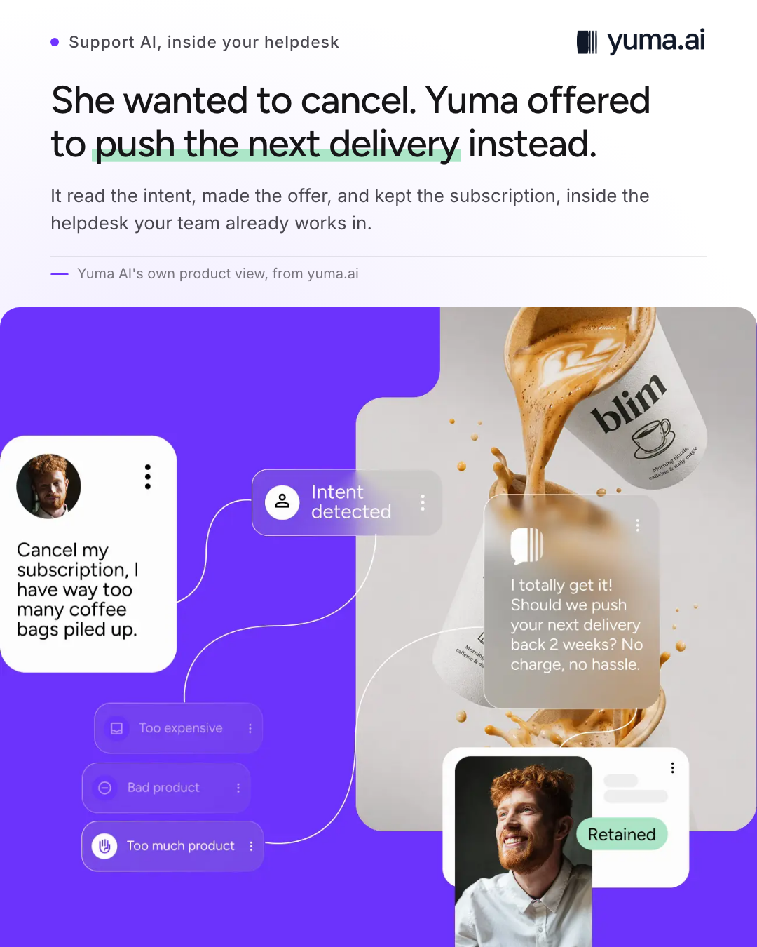
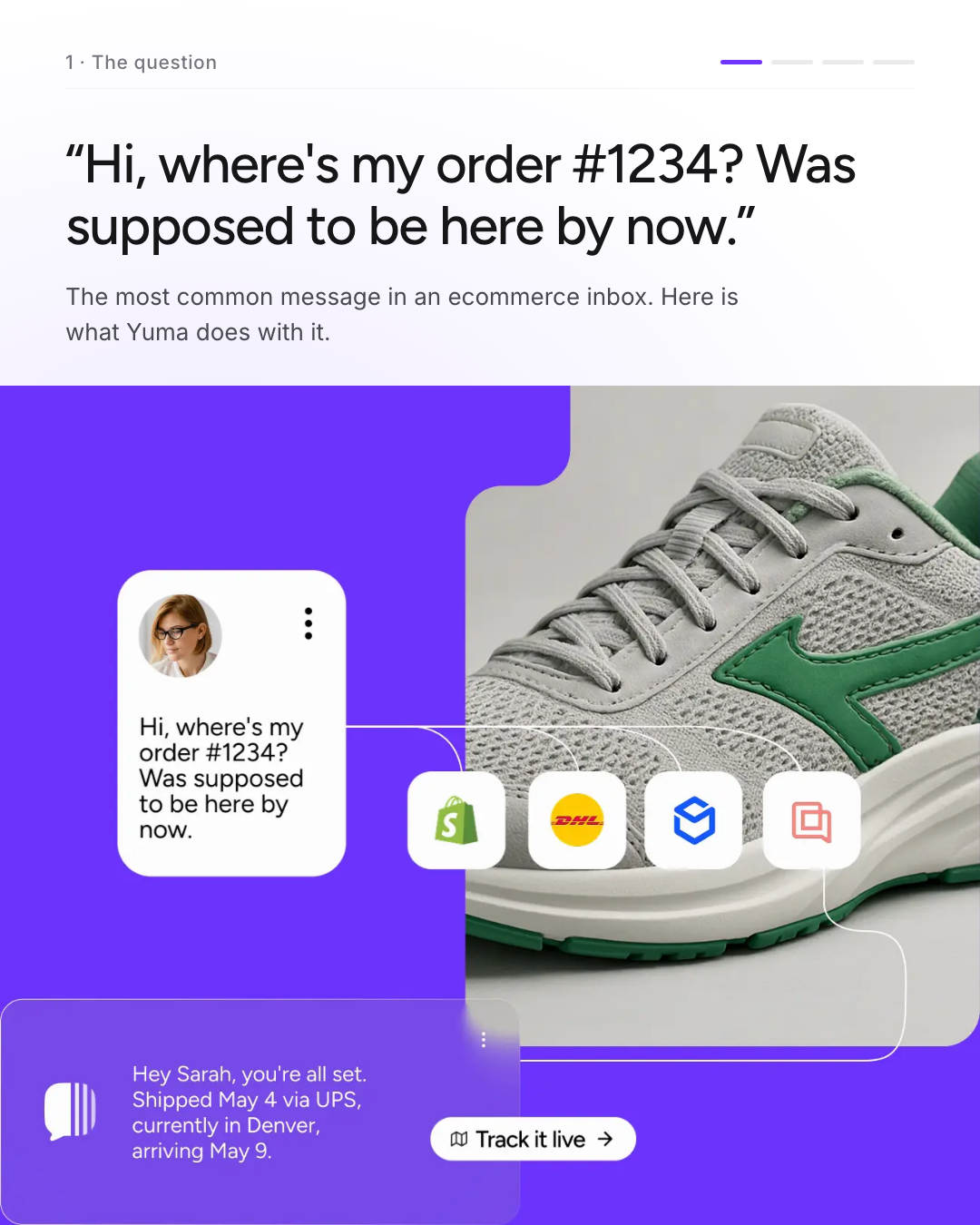
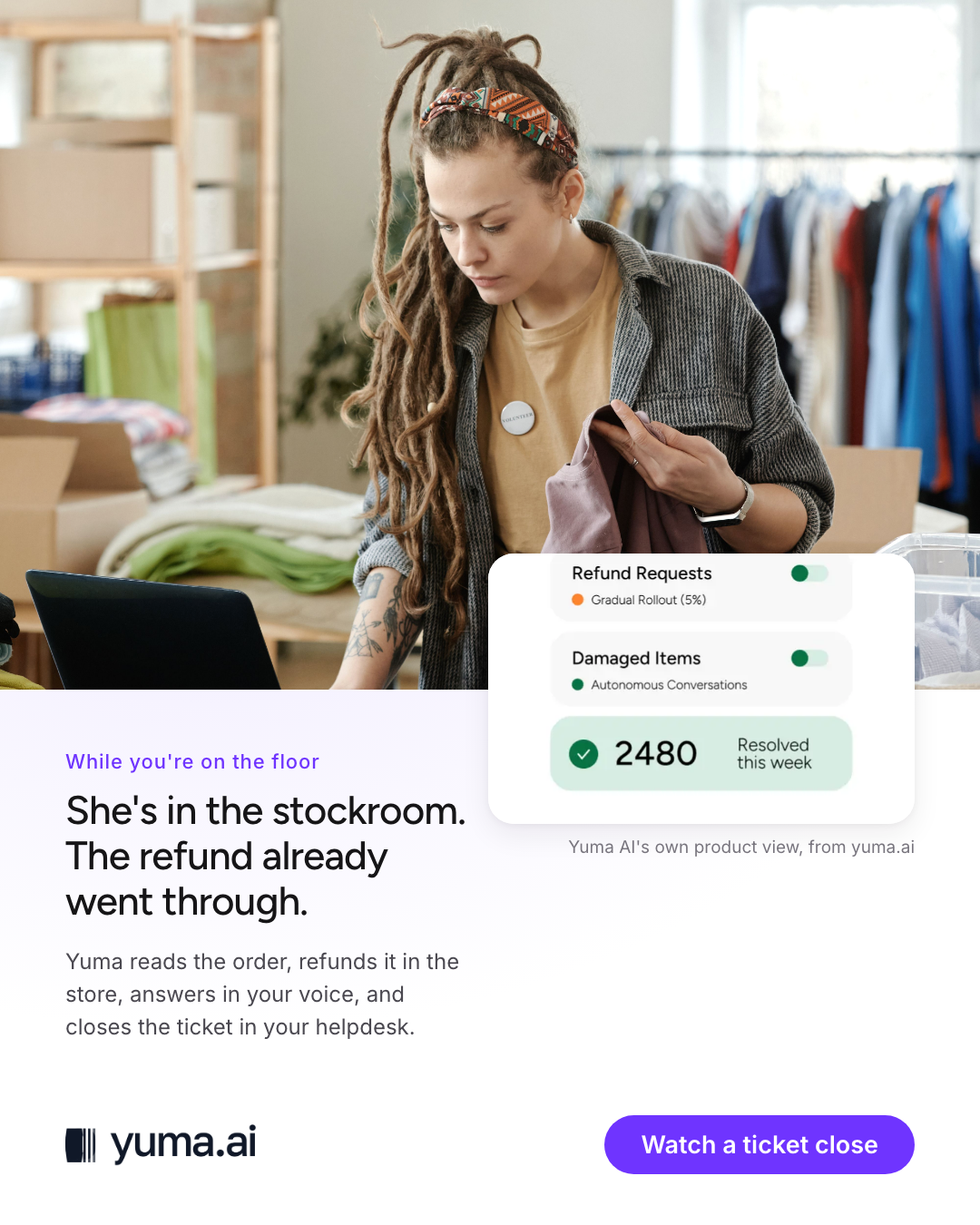
One ticket across four slides: the shopper's message, the action taken, the setting that let it run on its own, and the outcome chip. Every screen comes from your own image library.
A weekly resolved card. The mint tile with the number, one line of context under it, nothing else on the slide.
A merchant quote on the mint band, set in Figtree 500 with the logo small underneath, in the same shape as the customer strip on the home page.
Kamply designs posts like these every week, in this exact system. You approve, it designs.
See what Kamply makes