
Speedy Labs reads like an accounting product that respects the reader's time. The site is white, centre-set and built on one family and one blue, and the visual weight sits on money artefacts rather than decoration: a rebate ledger with matched and short-pay rows, a statement reconciled line by line, a stat trio. The writing names the problem in the distributor's own flat words, "Statements arrive, money arrives, and no one can prove the two match without days of manual work", then answers with mechanics instead of adjectives. Nothing on the page is trying to be exciting, which is why the numbers land.
The site already carries a strong editorial habit that a feed would take gladly. Every headline splits in two, the payoff clause flipping to blue, and the customer quotes are the sharpest copy on the page. A weekly rhythm could run on that: one quote a week set as a full-bleed headline, one money mechanic drawn plainly, one artefact from the ledger blown up to poster size. It would be recognisably the same page the reader landed on, arriving one card at a time.
- Headlines: Inter 800 at about -0.03em, line-height near 1.05, sentence case with a full stop.
- Two-tone rule: open the headline in ink #1E2939 and flip the payoff clause to blue #155DFC.
- Body and captions: Inter 400 and 500 in slate; 600 for labels and money figures.
- One family does both jobs, so size carries the hierarchy: a 60px h1 against 14px body on the site.
- Eyebrows sit small above the headline in blue, letter-spaced at 0.10em, sentence case.
0123456789
headlines
borders
calm
blue
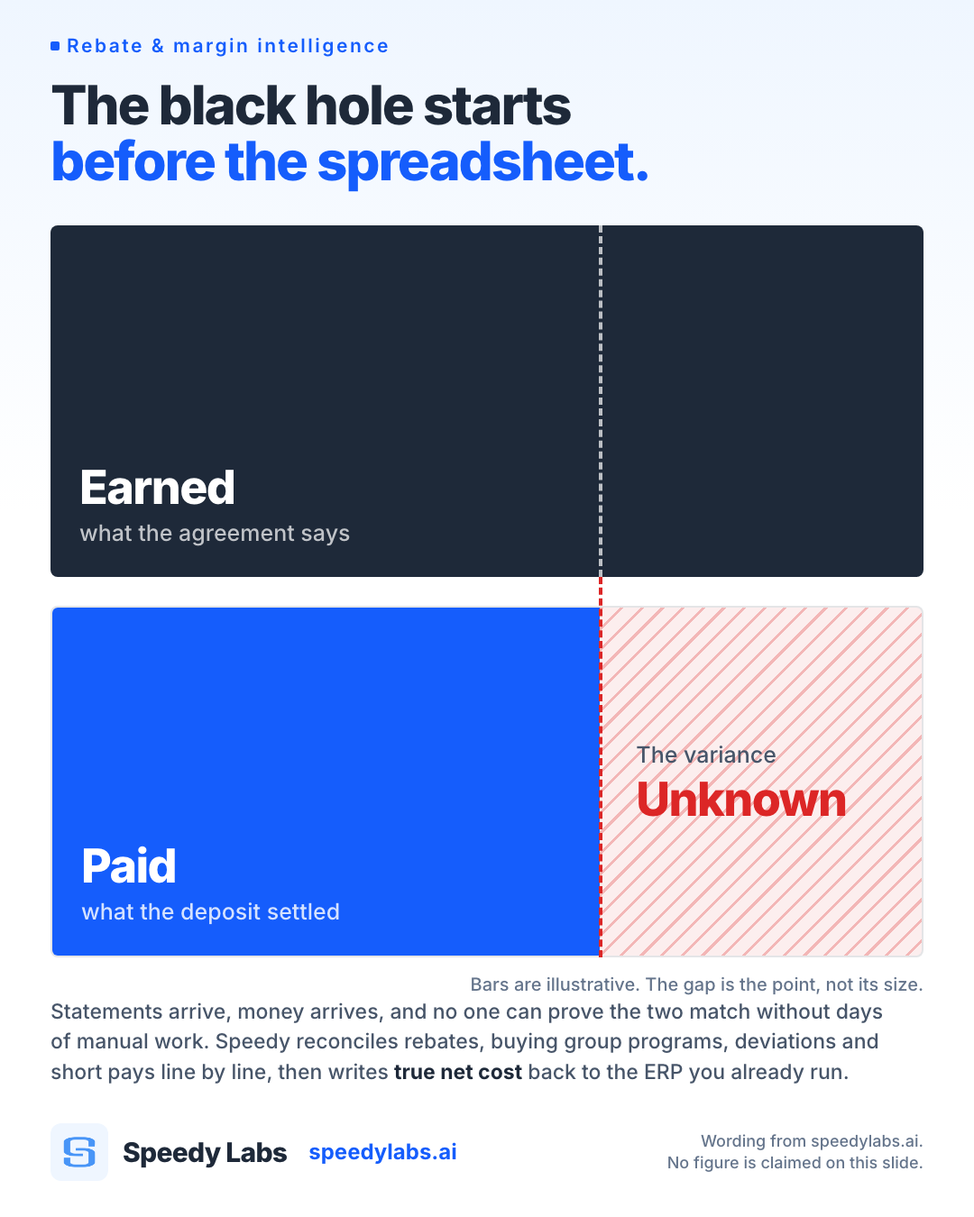
- Draw the money artefact. A ledger row, a statement, a variance gauge, a paper trail through four systems. The thing being reconciled is the most interesting object available.
- Label demo figures as demo figures, the way the site labels its own ledger "Illustrative demo data". It costs one caption line and buys the whole slide.
- When a person is needed, shoot the distributor's own world, a warehouse floor or a clipboard at month end, graded down to the light field so it sits with the white page.
- Use the semantic pair on anything that carries a status: green for matched and recovered, red for short and at risk. Those two are the only warm colours the brand owns.
- No mocked product screens. The site renders its ledgers live in HTML, so a drawn Speedy dashboard gets compared to the real one and loses; use type and geometry instead.
- No stock office photography or abstract data-viz filler. There is zero photography on speedylabs.ai, so a smiling boardroom would read as somebody else's brand.
- Keep customer and partner logos off the posts. They belong to the customers, and a wall of them says less than one sentence in their voice.
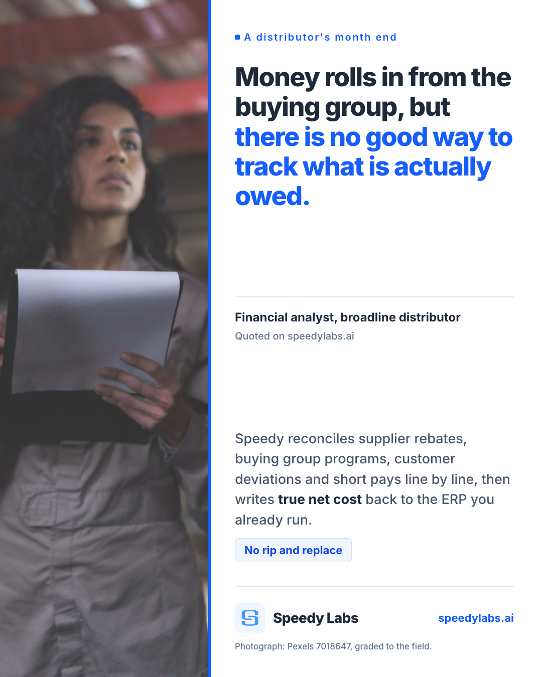
A quote card series from the site's own customer voices — "You trust the buying group and hope they are being paid correctly" set at 60px, blue on the second clause, attributed to the role rather than a name.
A one-mechanic explainer a week, drawn as a diagram: how a DOT Foods line gets re-attributed back to the manufacturer brand, in four labelled steps on the blue wash.
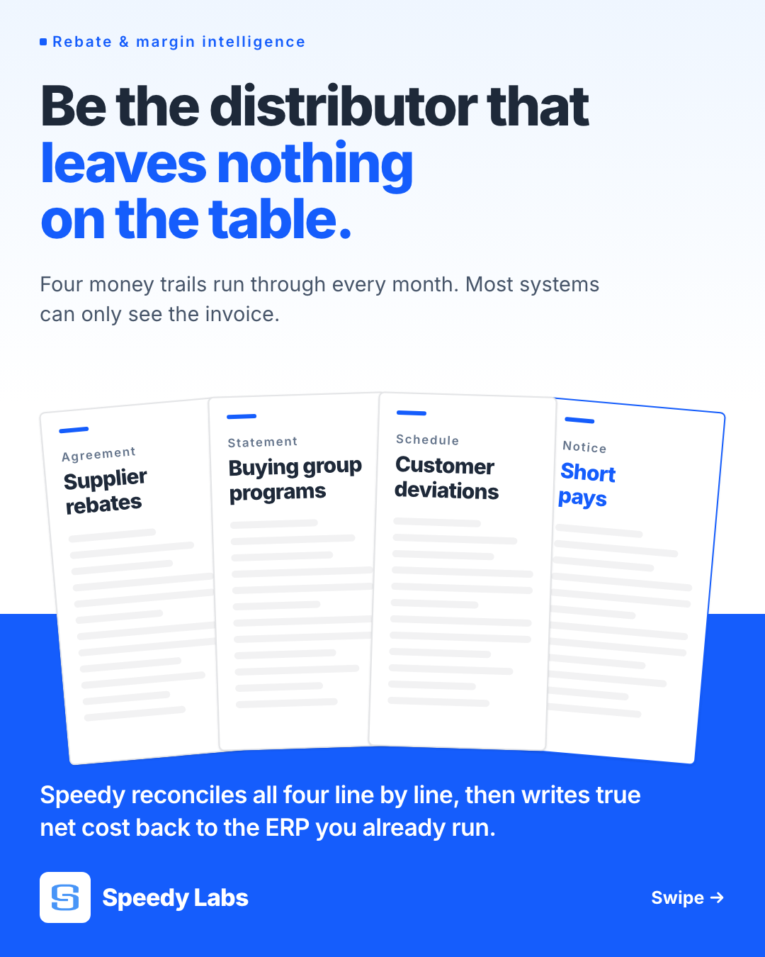
A month-end countdown carousel of the four trails that have to reconcile before close, one card each, ending on the plain line about writing true net cost back to the ERP.
Kamply designs posts like these every week, in this exact system. You approve, it designs.
See what Kamply makes