
Mave sells a wearable headset that asks for twenty minutes a day, and the site is built to feel like that much and no more. Warm off-white pages, one gold button, headings in sentence case that break across two or three short lines, and almost no shadow anywhere. The photography is one person outdoors in afternoon light rather than a lab or a clinic. Numbers are big and bare when they appear, and the research sits on its own page instead of crowding the front door. The overall register is calm and factual.
The site already answers what Mave is. A feed has room to answer what owning it is like: the mechanism in plain words, the shape of a session, what the first four weeks ask of you, and where the claims stop. Mave's own material has the raw material for all of it, from the three steps (wear it, start the session, move on) to the phase names for the timeline. Posts built on those hold up without borrowing an outcome number, and they give a follower something to repeat to a friend.
- One display family and one body family: Montserrat sets headings, Hanken Grotesk sets everything you read.
- Headlines break mid-phrase across two or three short lines rather than running the full width.
- Sentence case everywhere, including labels, badges and buttons.
- Eyebrows keep their job through small size, wide letter-spacing and muted ink, in sentence case.
- Numbers run large and bare: 20 minutes a day, 25+ years, three steps.
0123456789
off-white
surfaces
gold
moment
meets
dark
- One person outdoors in late-afternoon light, headset on, camera low into open sky. Calm and unposed.
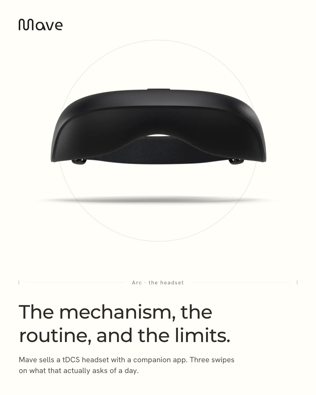
- The studio render of the Arc on transparency, centred, no props and no hand.
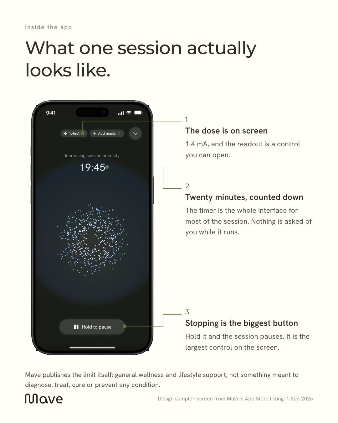
- Real screens from the companion app, dark with green accents, shown whole inside a real phone frame.
- Plenty of empty warm field around the subject. The site breathes and the posts should too.
- Clinical or laboratory staging. The product reads better in a normal afternoon than in a treatment room.
- Stock imagery of distress or headaches. The brand talks about the routine, not the symptom.
- Drawn or approximated app screens. A real screenshot always beats a redraw, and the difference shows at thumbnail size.
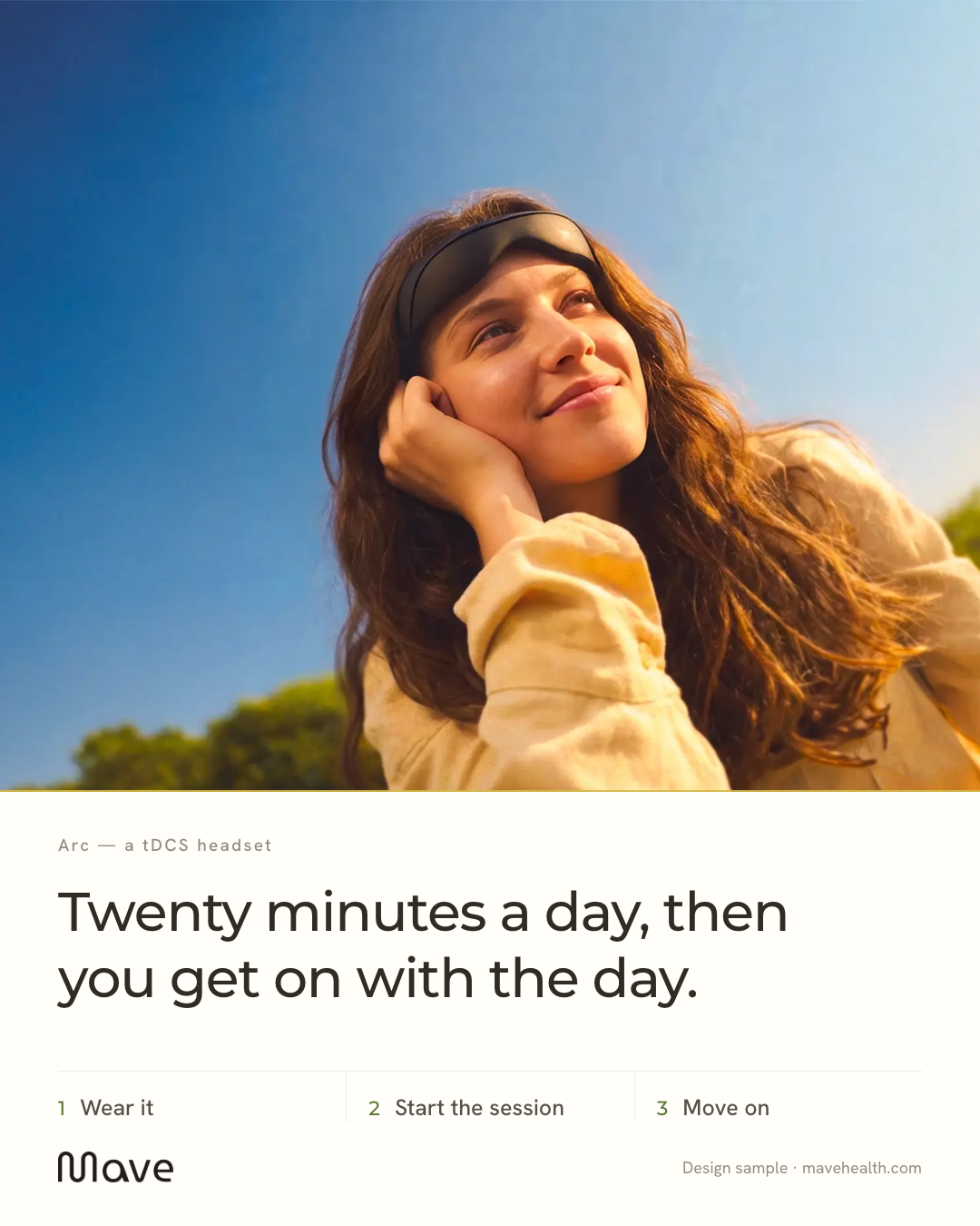
A three-step routine post on the warm field: wear it, start the session, move on, with the outdoor photograph bleeding across the top two thirds and a gold hairline seam under it.
A four-slide carousel that spends one slide each on the mechanism, a real session screen, the week one to week eight phases, and the limits Mave publishes about itself.
A single annotated frame of the live session screen, with thin green leaders running from the readout, the countdown and the pause control out to short notes on the right.
Kamply designs posts like these every week, in this exact system. You approve, it designs.
See what Kamply makes